During fall of 2023, I had the opportunity to take a class at the School for Poetic Computation, an experimental school in New York founded in 2013. The school supports interdisciplinary study in art, code, hardware and critical theory.
I was part of a 10 week long virtual seminar called Drawing Data by Hand, producing data sketches and reflections and studying topics ranging from data collection and organization to access, bias and forms. Within our cohort of folks from diverse backgrounds and professions, we analyzed different datasets and their representations. We did a deep dive into ethics, historical inconsistencies and the biases in funding, access and interests surrounding data. Collectively we also came up with what our ideal data contracts would include to start to try to understand consent.
The outcome of the class is a publication compiling the students’ sketches and final projects, to be released in January 2023.
Data sketches
Social network
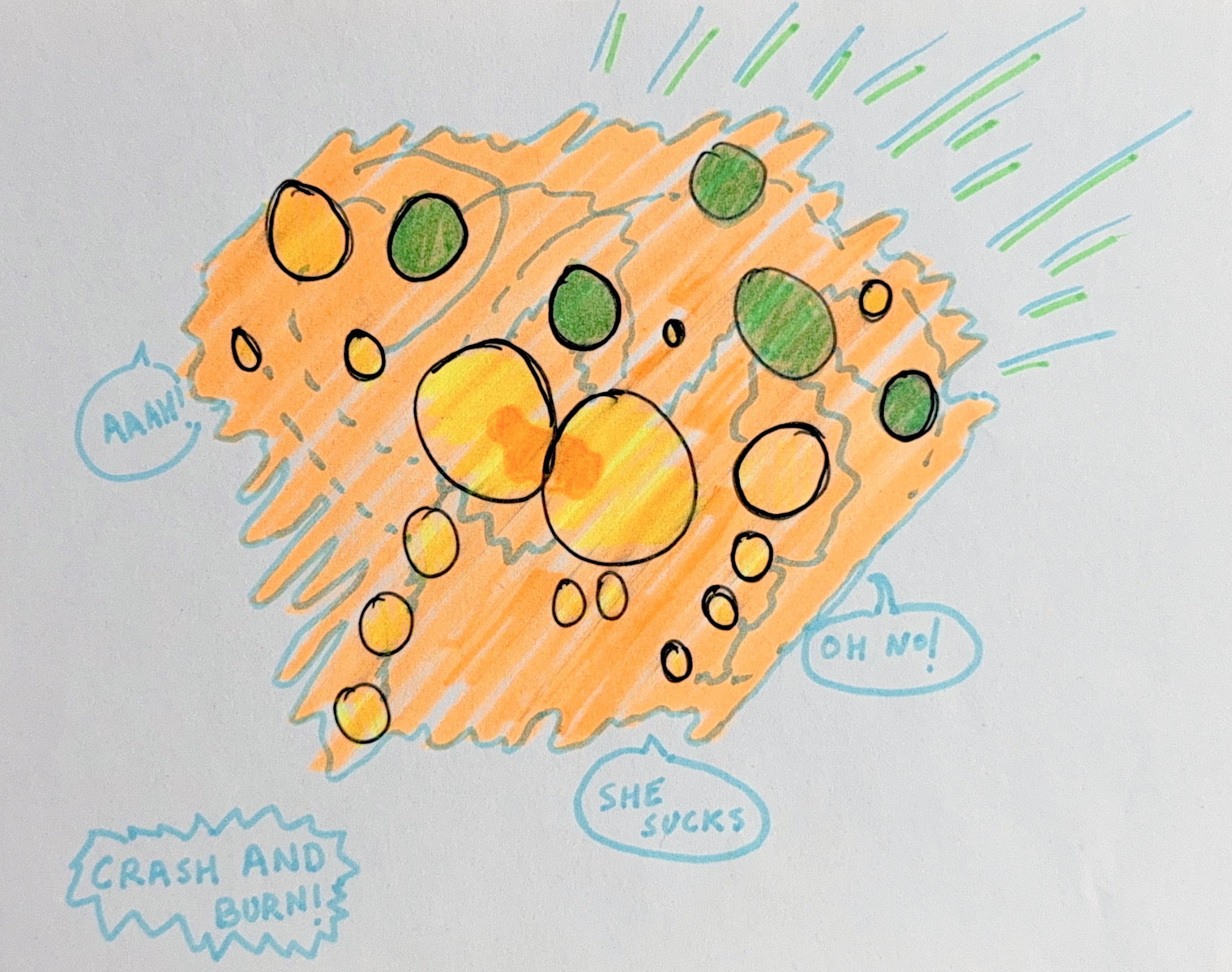
Crash and burn
She loves me, she loves me not
As one of our weekly warm ups, I drew a quick sketch of a network diagram of the data set of my friendships in greyscale and only using line width and distance to provide meaning. Through subsequent weeks, maintaining the same data, I transformed the sketches to adapt using color after our lecture on visual perception of art and the meaning it adds to data inspired by Stephanie Posavec’s Data Portrait Badges. Eventually I also translated the data into 3-dimensions using dried flowers to indicate the strength of different relationships.
I started asking a lot of questions about my data identity, both public and private. While participating in the seminar I was traveling frequently and decided to display the data set of food I was eating on airplane food menus, with the hope of the medium bringing meaning to the data art. Instead, the biases held in those menus surfaced with the lack of ethnic ingredients present in the food served on American airlines. My culture and the love for it’s food is a large part of my identity, and this representation of “who I am is what I eat” came out grossly misrepresented and lacking any of the aromatic spices my food in those weeks really had.
You Are What You Eat
Mapping Through Music
A traditional map uses the dataset of physical features of the world to provide material information like cities, countries, roads and other geographical features of our planet. But we create the world in our minds with sentiments beyond physicality like the smells of cherry-blossoms walking down Fifth Avenue or the taste of mango sticky rice in Thailand. To me, attachment between music and places is the deepest. For a more long-form data sketch produced in this class, I created a personal data-set of songs and coordinates across the world and created an interactive map devoid of any other labels. I also found a vintage atlas from National Geographic, and used that to scrapbook part of my ever-growing playlist of the world.


